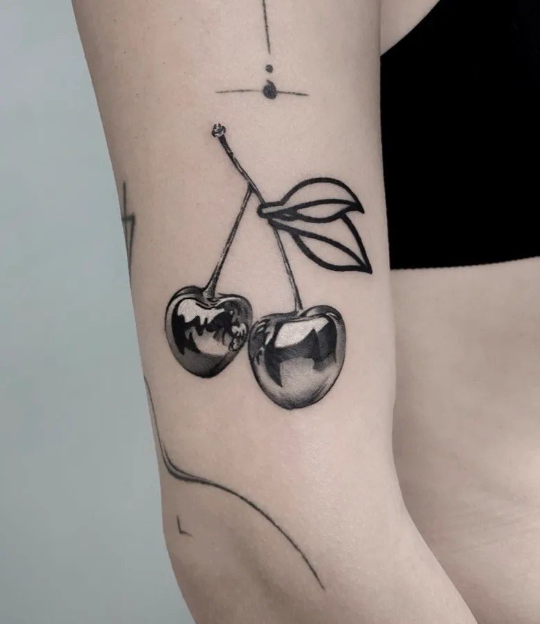
Almost all my work is in black & grey — black and white, with the whole spectrum of greys in between. It is not a limitation but a choice. Here is why black & grey suits the way I tattoo best.
What black & grey means
Black & grey means I work only with black diluted to different intensities, from deep shadows to fine greys. From these tones I build volume, texture and depth — exactly what a realistic portrait or a microrealism piece needs.
Why it suits microrealism
Realism lives on light and shadow, not on colour. Black & grey gives me full control over contrast and transitions, so I can render a gaze, the texture of fur or the depth of a photo without colour distracting from it. For the subjects I love — portraits, animals, realistic objects — it is the most fitting language.
How it ages
A well-made black & grey tattoo ages gracefully. The contrast between black and skin stays readable over time, and fine greys, placed correctly, keep the impression of depth. It is an understated, timeless style that doesn’t “go out of fashion”.
If you want colour
If your idea really calls for colour — colour realism, a reinterpreted classical piece — my colleague Vlad Boiț, at Ace, also works in colour; see his work at vladboit.ro. I’m glad to point you the right way, even when I’m not the one making the piece.
If you like the black-and-white aesthetic and clean realism, we’re on the same wavelength. Message me on Instagram, at @rox.tatts, with your idea.